Zina is a dedicated bibliophile and curator of stories. She needed a brand identity that felt as immersive as a day spent reading by the water. The goal was to create a cohesive visual language for her Instagram presence that felt sophisticated, scholarly, and serene.
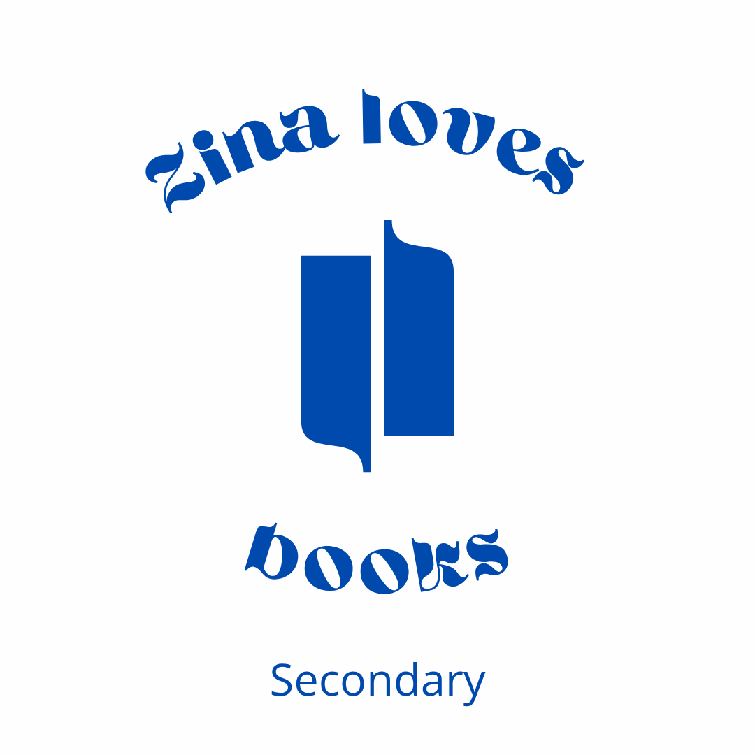
Zina Loves Books - Brand Identity, Social Media Strategy

The Design Strategy
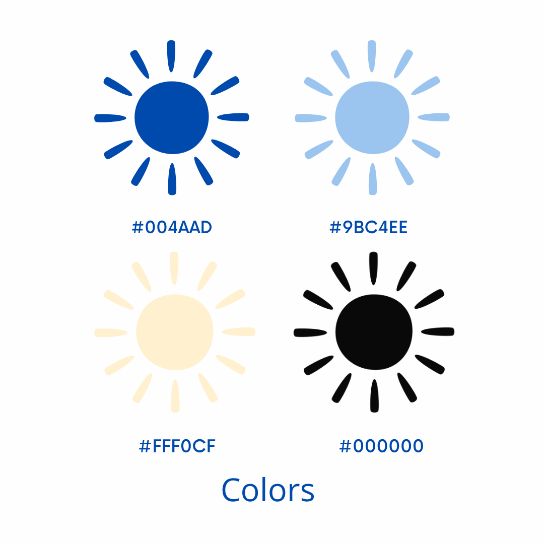
The identity is anchored by a deep "Ocean Blue" and a soft "Sand" palette, bridging the gap between a traditional library and the coastline.
Typography: The use of Ahsing provides a bold, vintage-inspired personality for headers, while The Seasons and Open Sans offer a clean, readable contrast for long-form reviews and captions.
Iconography: The primary mark—a stylized, abstract book—mimics the architectural lines of a coastal landscape.
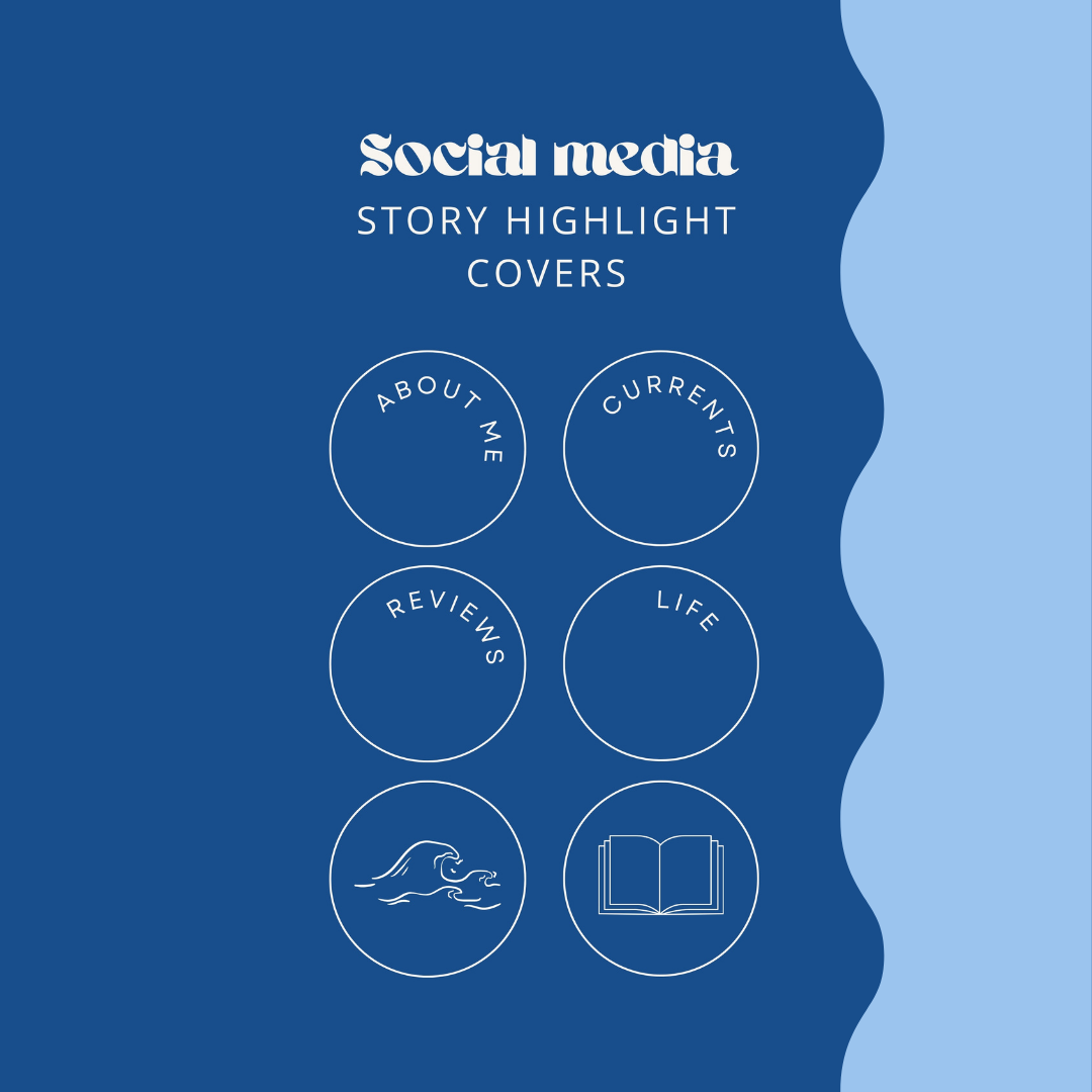
Digital Touchpoints: Custom-designed Instagram Highlight covers ensure a "grid-first" experience, allowing the brand to remain consistent across ephemeral content.