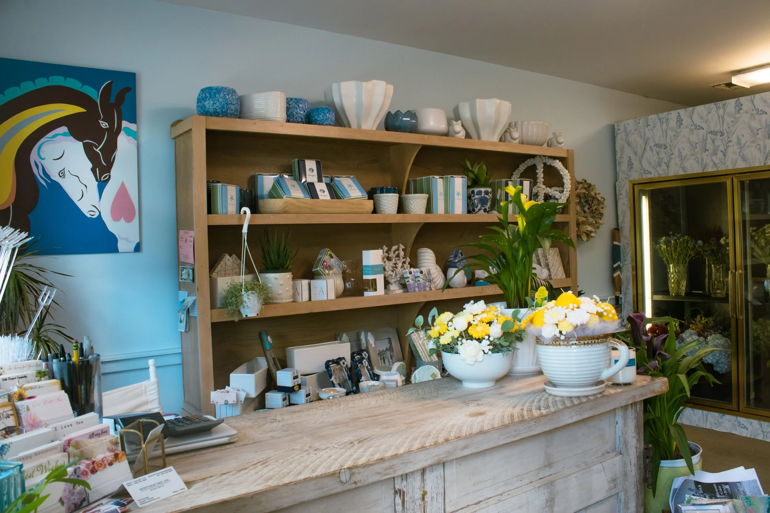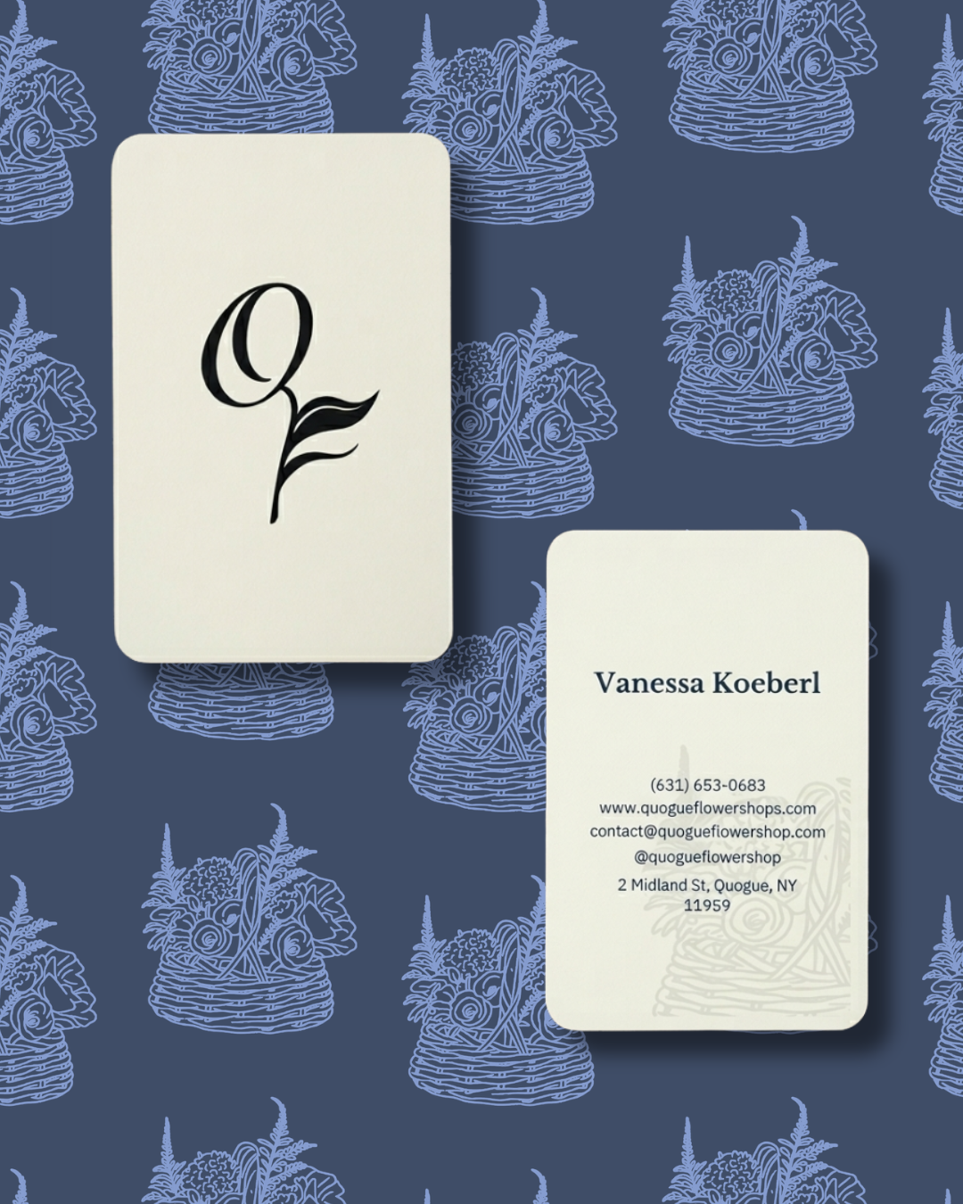

A visual refresh rooted in local heritage and the organic artistry of nature. This project involved a full brand transformation for an East End florist, including a custom logo system, a sun-drenched editorial photography suite, and a tailored Squarespace e-commerce platform designed for an intimate, high-conversion user experience.
Visit the website!
Quogue Flower Shop - Logo Design + Brand Photography + Custom Squarespace Storefront
The Design Strategy
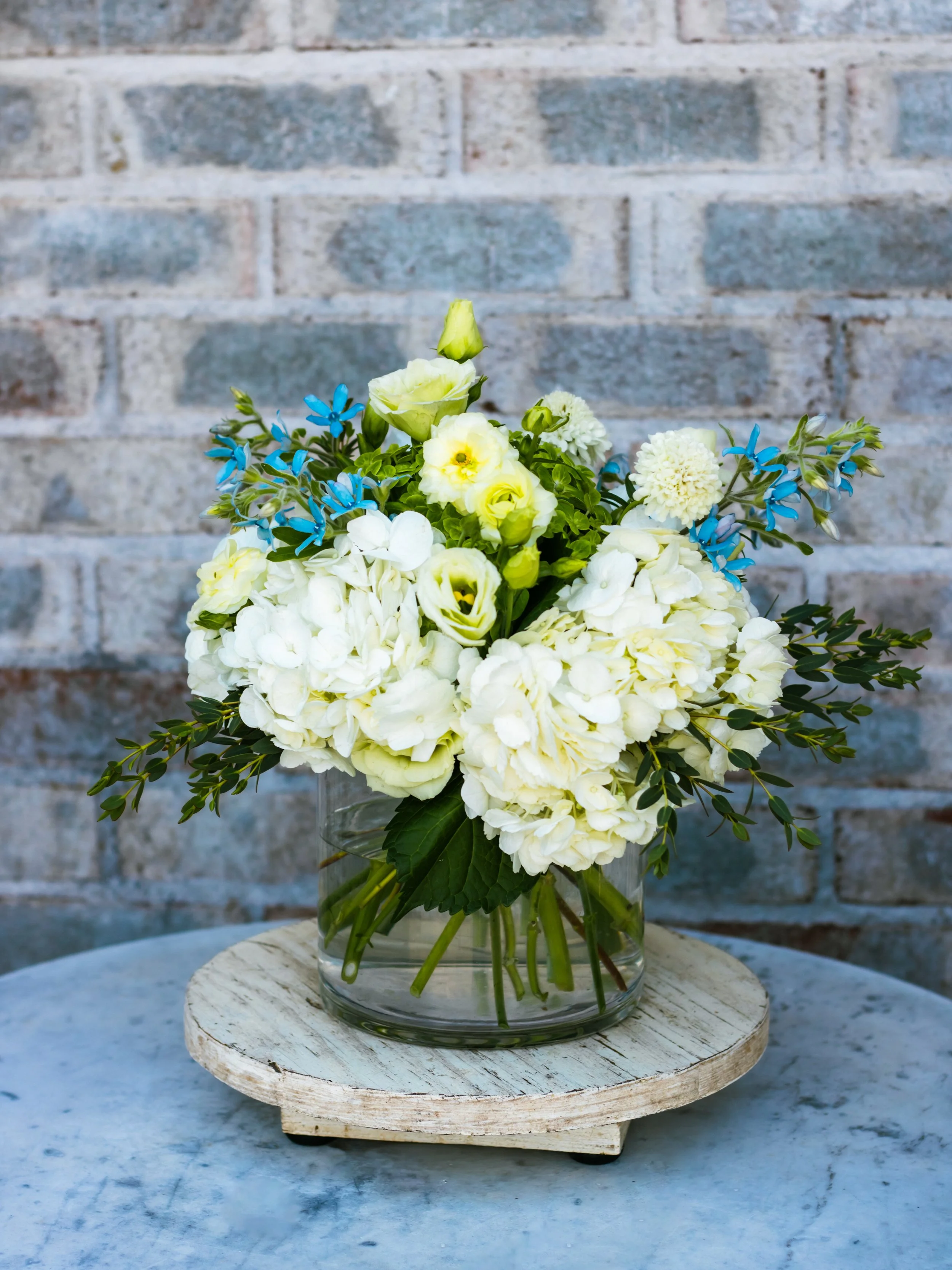
The digital presence for this eastern Long Island landmark is built around an authentic, organic aesthetic. We utilized light and warmth to mirror the premium, tactile experience of stepping into the physical studio.
Typography: The intentional use of Libre Baskerville serves as the main font, bringing a classic serif feel, historical elegance, and trusted craftsmanship to the main headings and brand voice. This is balanced by Montserrat as a clean, geometric secondary font for the body copy, ensuring modern readability across the e-commerce platform.
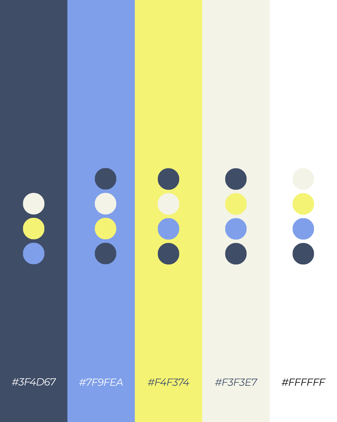
Color Story: A curated coastal palette contrasts beautifully and mimics the natural interplay of the local sky and botanical forms.
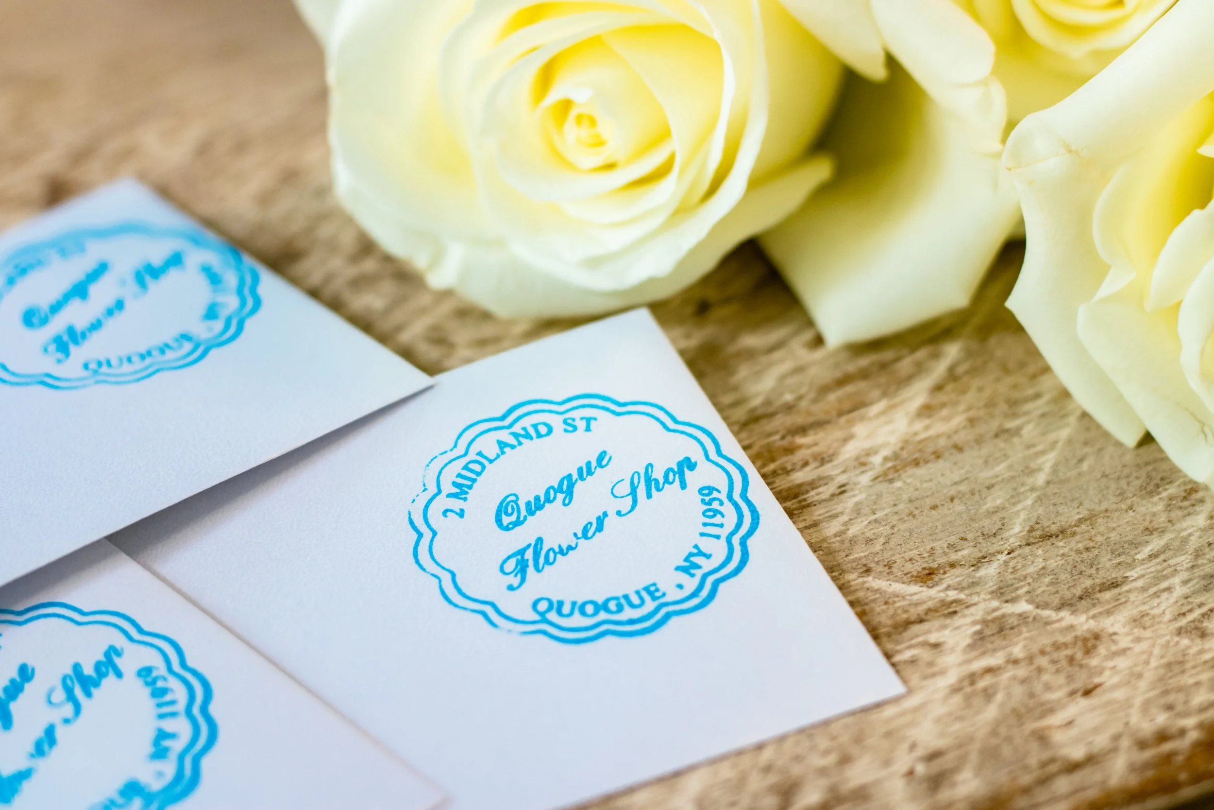
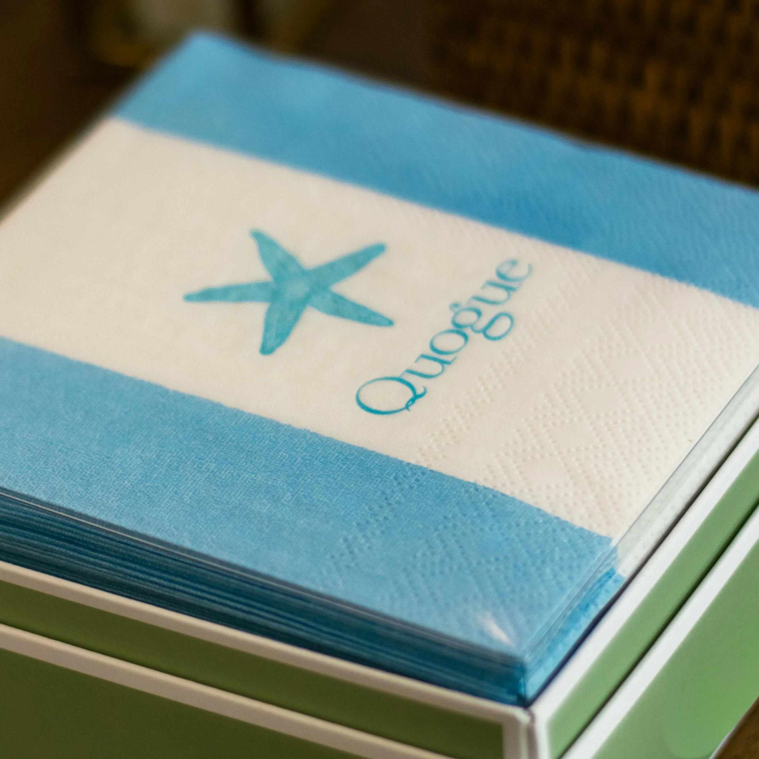
Iconography: The custom logo system balances a refined botanical "Q" representing tailored growth with a hand-drawn digital Heritage Seal of the shop's iconic signature display basket, reinforcing their community legacy and a gentle human touch.